Accordion
How it works
The accordion Carbon component provides a vertically stacked layout for web
content, commonly used to reduce scrolling. The accordion header is a button
that is used to expand and collapse each accordion panel. Buttons are used so
that the accordions are tab-able by keyboard users and accessible to screen
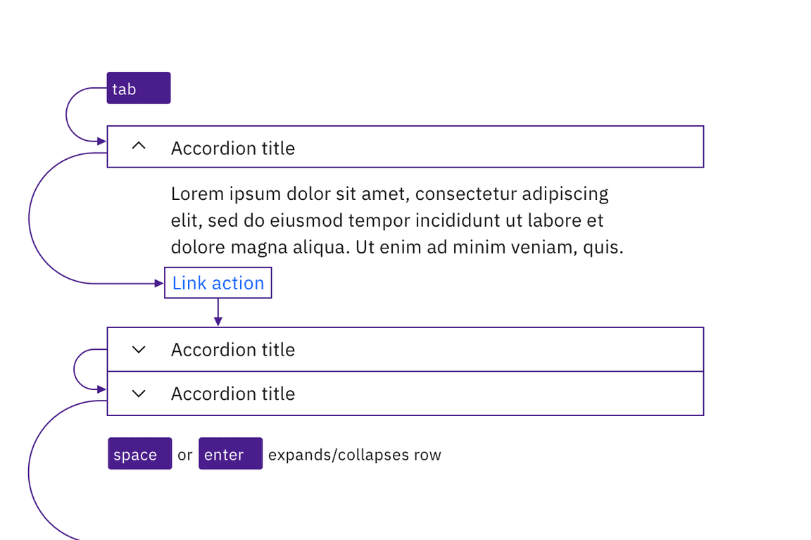
readers. Tab and Shift-Tab are used to navigate through each accordion
header and all focusable elements in the accordion should be included in the
page Tab sequence. Enter or Space expand and collapse each accordion
panel.
When an accordion panel is collapsed the content is hidden, therefore the ARIA
state aria-expanded="false" advises users of assistive technologies that the
accordion panel is not visible. When the accordion header is expanded the ARIA
state changes to aria-expanded="true" and the accordion panel content is
displayed. Each accordion header contains an ARIA label, and the header buttons
have an ARIA-control property set that points to the unique id of the panel it
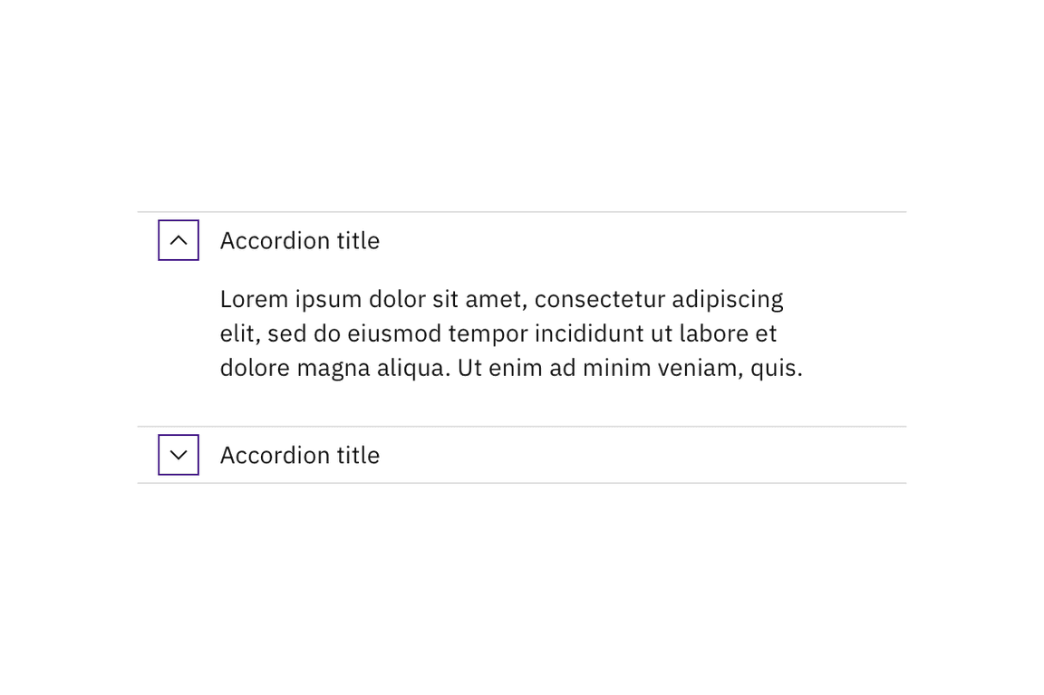
controls. When focus is on the accordion header there is a prominent style
change to the border as well as background of the accordion header.
Accessibility considerations
This component has been validated to meet the WCAG 2.0 AA and Section 508 accessibility guidelines, however changes made by the content owner can affect accessibility compliance. Be sure to review and follow the guidance in this section when updating or adding new content to this component.
- Each accordion header must have a unique title (implemented via the label for the button) that clearly describes the accordion panel content. This is particularly helpful for users of assistive technologies so they have the necessary information to efficiently navigate the content without having to expand every section.
- Carbon components should be used to create the content that displays within each accordion panel.
- Avoid keyboard traps when adding components to the accordion panel. For example, the user expands an accordion, but is unable to tab to the next focusable element.
- Although the accordion component passes accessibility testing, content authors need to ensure the content that is added to the accordion is accessible. For example, if you add an image to the accordion header or panel you need to include alternative text to pass accessibility testing.
Resources
- W3C WAI-ARIA Authoring Practices Accordion Design Pattern covers the usage of ARIA names, state and roles, as well as the expected keyboard interactions.
- IBM Accessibility Requirements:
- 1.3.1 Info and Relationships (WCAG Success Criteria 1.3.1)
- 1.3.2 Meaningful Sequence (WCAG Success Criteria 1.3.2)
- 2.1.1 Keyboard (WCAG Success Criteria 2.1.1)
- 2.1.2 No Keyboard Trap (WCAG Success Criteria 2.1.2)
- 2.4.3 Focus Order (WCAG Success Criteria 2.4.3)
- 2.4.6 Headings and Labels (WCAG Success Criteria 2.4.6)
- 2.4.7 Focus Visible (WCAG Success Criteria 2.4.7)
- 4.1.2 Name, Role, Value (WCAG Success Criteria 4.1.2)
Accessibility testing
Accessibility issues are tracked in the Carbon Component GitHub repository.
Automated test
Carbon bakes keyboard operation into its components, improving the experience of blind users and others who operate via the keyboard. Carbon incorporates many other accessibility considerations, some of which are described below.
Keyboard interactions
Each accordion is a tab stop. Space or Enter keys expand or collapse
accordions, which are collapsed by default. Interactive elements within expanded
accordions integrate into the tab order automatically.

Accordions and interactive elements in the expanded content are in the tab order and keyboard operable.
Labeling and states
The collapsed or expanded state of the accordions is programmatically set by default, eliminating the need for designers to provide text equivalents for the chevron icons.

Carbon handles the accessibility of the chevron indicators.
Design recommendations
Design annotations are needed for the following instances.
Headings
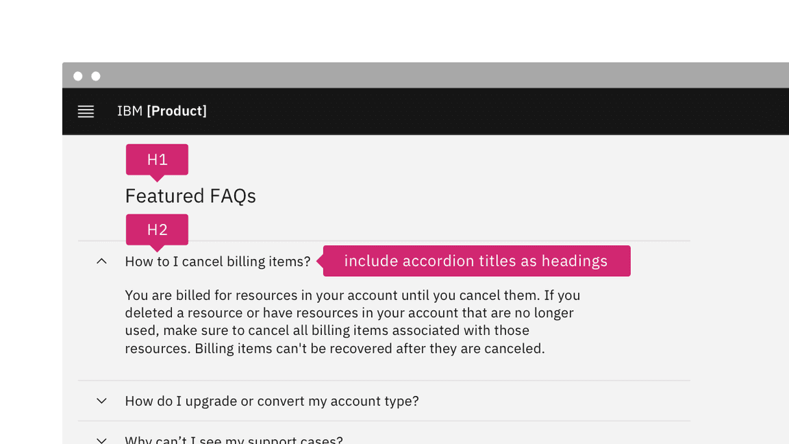
Carbon accordions are not set as headings by default. For improved accessibility, annotate accordions as headings on the first occurrence in a product. Annotate the heading level of accordions as needed. See Indicate heading levels.

If accordion titles act as headings, annotate for development.
Alignment
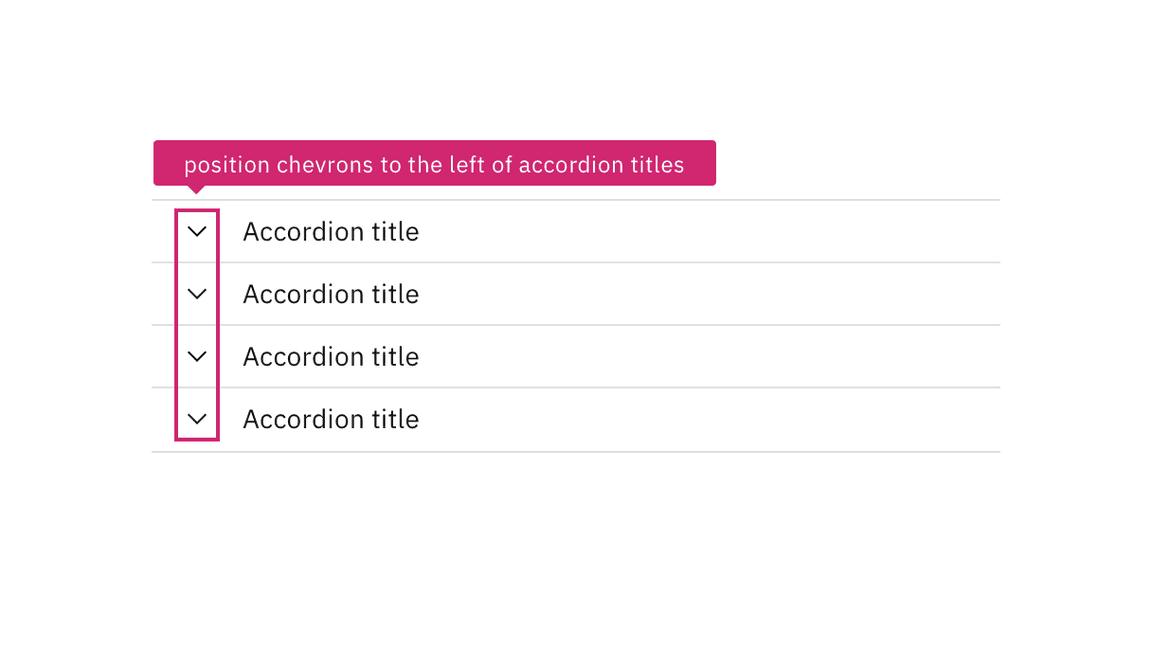
Carbon chevrons are right-aligned by default, but left-aligned chevrons are more accessible for users with low vision, as the expanded/collapsed indicator is closer to the accordion title.

Annotate if the accordion chevrons should be left-aligned.
Development considerations
Keep these considerations in mind if you are modifying Carbon or creating a custom component:
- The accordion header has a role of
<button>, with anaria-expandedattribute set to"true"or"false". - The button has an
aria-controlsproperty set to the unique id of the panel it controls. - Since accordions are typically grouped together, Carbon puts each button inside a list item in an unordered list, which provides additional context to screen reader users; where only one accordion is used, it should not be put in a list.
- When accordion titles are used as headings, the buttons are also wrapped in an
element with an appropriate heading level; ARIA can be used to set both the
heading role and the level (via
aria-level). - See the ARIA authoring practices for more guidance.